Starting off with the designs, I feel there was a lot of great things about them. They were eye catching and looked different in terms of layout and style to what other people had produced.
The top three things about my design for me would be, the icons, dynamic layout and scenario themes and then making one of them into an animated video.
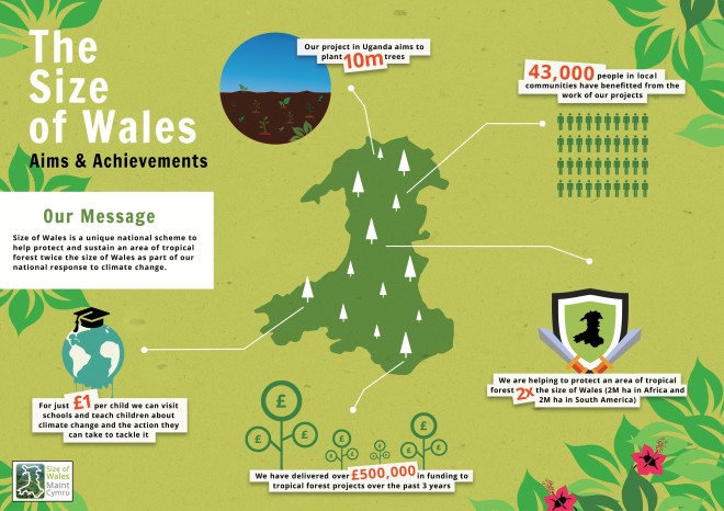
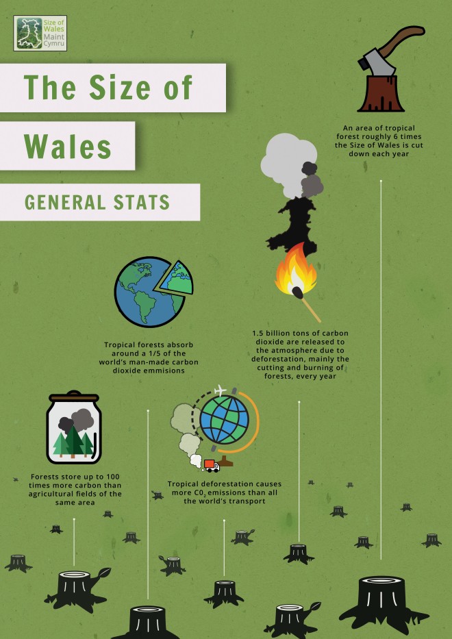
Starting with the icons, I feel these added something really interesting and eye catching to the poster. By creating them, they helped reinforce all of the statistics on both designs and making the design more visually appealing with more colour and dynamics.
Linking closely to the dynamics of each design, I felt they were very intriguing, making more interesting to look at. Because of this and the two scenario style I designed them as it made them look less flat than just a regular 2d design. I was able to achieve this with the use of drop shadows especially, making items look as if they were raised off the page, making the designs look as if they had different layers, much like a rain forest should do, linking nicely to the project and theme.
The third thing that I thought was good about my design was that I was able to bring one of them to life by turning it into a short animation. I did this because it would add a different aspect of my work and hopefully give it an even more engaging and realistic edge. I thought the sounds in particular were really good, making in more immersive for the client watching. But in general the video made my project a lot strong and interesting as a whole as I believe people are drawn more to them, rather than flat designs.
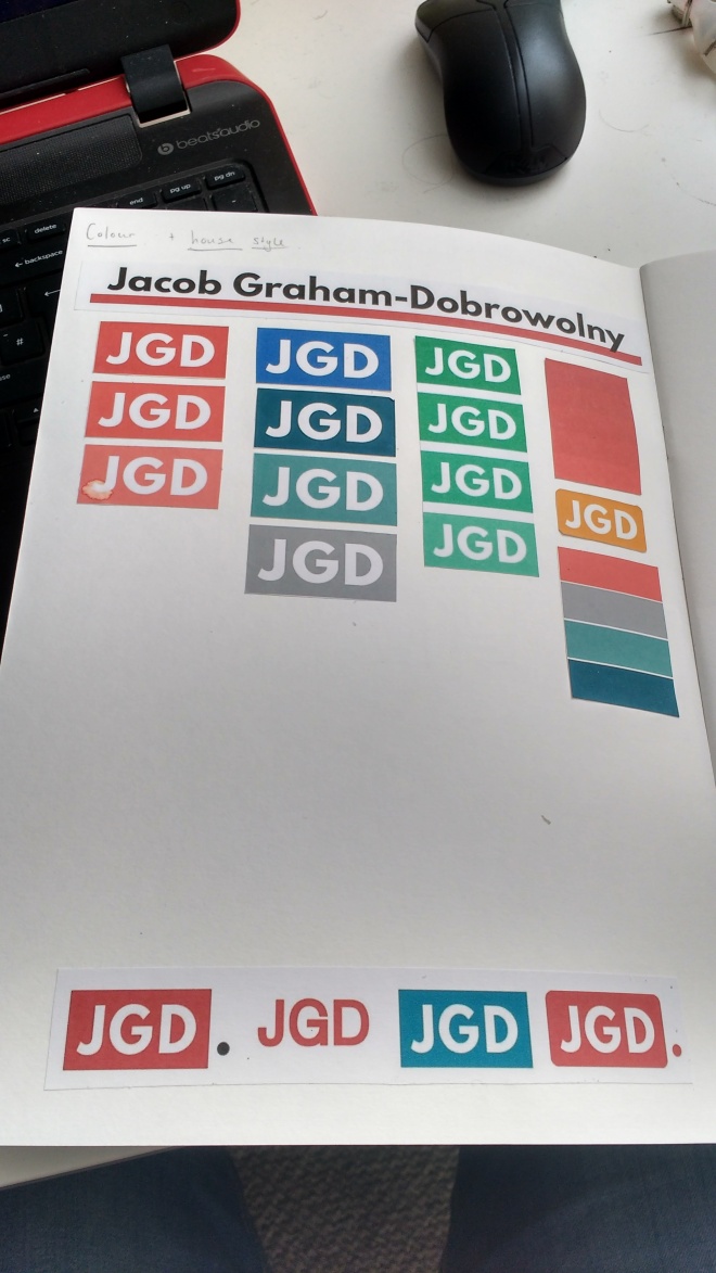
Things that could possibly change with my design are some of the icons, different layout experiments and point size.
The icons in question are the ones on the Aims an Achievements poster. Although they are all nice looking and help back up and reinforce the statistics, I feel they could be produced in a similar house style, more like the other infographic. This would make it a bit clearer to understand and increase its professional finish.
Moving on, I am not sure what I would do differently when it comes to the layout of the Aims and Achievements poster because I believe it flows quite nicely. For the General stats on the other hand I Would try and change the positioning of the icons and statistic to see if they could flow and sit a bit better on the page. At the moment I feel that it just doesn’t have that consistent flow.
The point size. The only reason I would change this is for digital use. During the presentation it was difficult to see the text on the big screen. This is not a great concern to me because these designs are meant for hard copy use which the text can be read clearly.
Thing that went well in our presentation is that everyone spoke clearly and knew what they wanted to say about our work. The presentation on the screen was also clear, well put together and followed a simple structure which kept it all looking professional, making our life easier when presenting but also the clients.
One thing to improve on a personal level is that I should have spent a bit more time rehearsing and finalizing what I wished to say. I had a general idea of what I wanted to say, bu should have been more clear with myself as I missed out a few things that I shoud have mentioned, like I had created a video for them.
On group level all I can say is that we should have rehearsed together so we knew our cues when it was our turn to speak.
Overall, this project has been great fun to work on and has opened my eyes up even more when it comes to working with and understanding clients. I am also glad o have used imovie as I feel a lot more confident using video, and feel it would be a good idea to use it other aspects of my work.
 This is my final design for my CV. I have changed the layout so it fits a landscape page, and by doing this as well I have been able to add an about section, giving employers more of an insight to who I am.
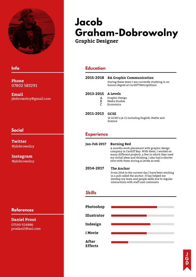 This was my first outcome of my CV design. The theme and style is bold and modern, things that I feel both describe me well. The elements that give it this feel is the choice of colour and fonts, both loud and very noticeable.