Final Exhibition

This is what my final exhibition looks like, it has changed a bit since the first mock ups and sketches but I am glad it has. In reflection it looks a lot less crowded with things popping out at you instead of being overwhelmed with no sense of direction. I think looking back this is the best piece of work I have produced over the three years and it shows how I have developed as a young designer, experimenting and pushing design boundaries more.

Review of Field

If I thought subject was going to be hard then, I was in for a little bit of a shock for when it came to field, but for different reasons. It was the sheer quantity of work that needed doing for this module that threw me a little bit. I think there were a total of 4 projects in this section: Penguin book cover, Dissertation design, Criticality and our FMP.

Penguin wasn’t that bad because I already knew what to expect for that project, but the dissertation design is where it started to be a bit of an up hill battle. I think this was becuase we were tasked to design the first chapter while we were working on criticality, which is another story in itself. Around this time, what made it more difficult for me was that my laptop broke and I lost some of the files as not everything was backed up. i think though this was a blessing in disguise because it meant I had to re design the first chapter of my dissertation. I was never really happy with my first design so beign able to start from scratch was much better and I am much happier with how my design progressed.

So we move on to criticality. Initially I had no clue what I wanted to do for this project. The brief was confusing and possibly too open. But I essentially got my head round it and simplified it to “Take something orthodox about graphic design and change it some how.” Initially I was really struggling for ideas but I had a look at the road-signs and thought, some of those aren’t representative of the time anymore, and some new one could possibly be made now. If I could go back and work differently on this project I would not rush the initial stages as much. I think I rushed it a tad because it was only a two week project so I didn’t think much of it. All I can say though, this project was also a blessing in disguise as it informed me and gave me a platform for my FMP, my favourite project to date. I feel because of my situation earlier in the year with Design for Real, I coped with this better. This was only a short project as well so I think that helped as I didn’t have as much time to worry and not get anywhere, so I just decided to get on with it all.

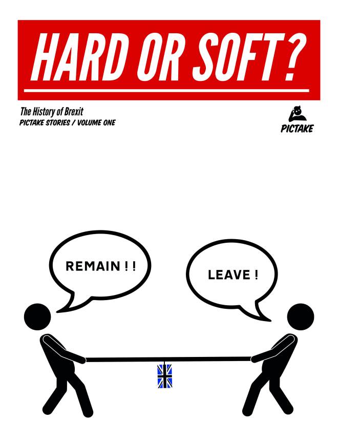
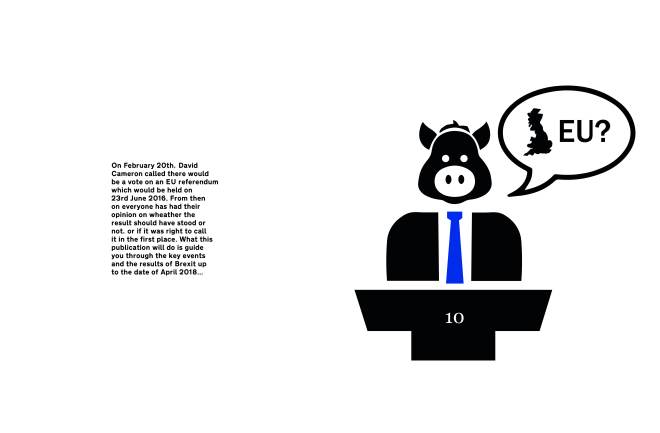
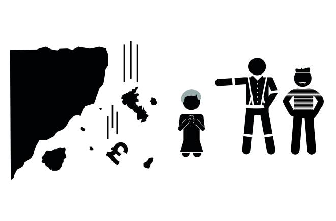
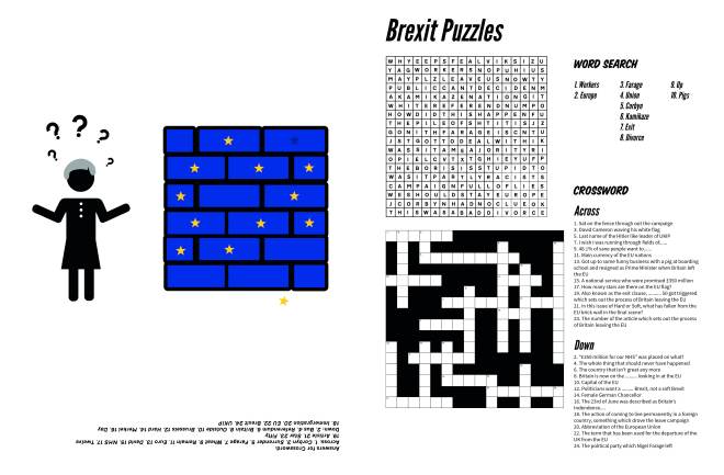
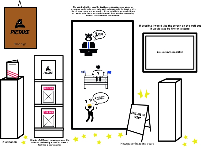
So then we move onto the big one, FMP, the project where we all have free choice on what we set ourselves as a brief. Mine kept changing and being tweaked but that was fine so I could make sure it was the right brief for me, something that would keep me interested and engaged. The actual brief that I set myself for this was “To create something satirical depicting the story of Brexit using pictograms. I also wanted to create a brand for this, something that I can use after uni and build upon and depict other scenarios in a similar manner.” As time went on the brief became more set and I decided on presenting the story in a newspaper format which I will then produce an animation out of. And as I mentioed above, Criticality was the starting point of this project for me, giving me a good platform to work from and expand upon.

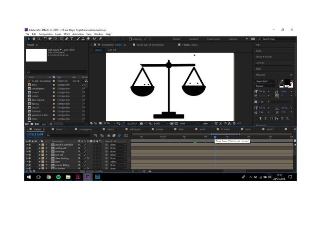
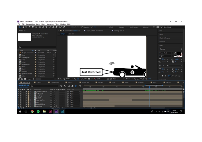
From the offset this has been my favourite uni project, mainly because I had full control of what I wished to do. Saying that it wasn’t all easy fun and games. The animation in particular was a pain as I had to learn the software before I could really get going with it, but once I got the hang of it I couldn’t stop editing. When it came to designing the characters this started off slowly. I had done the research into pictograms and the consistent style they had to be but that was the difficult bit about it, refining them all so they were consistent. This project was a real eye opener in terms of getting physical things ready for a deadline, as most of the projects it has been just a digital submission, but with this we had to take into account printing and setting up the exhibition. Although this was stressful I feel it has now prepared me better for those real life situations and deadlines. To be honest, with this project I can not wait to start expanding it with other scenarios, big and small.

Overall I have enjoyed field more than subject but I think I gained value experience from both. I can also confidently say I have progressed so much as a designer, not just from day one to now, but from project to project. I have become more considerate and thoughtful about design, pushing ideas and boundaries. Designing is not a job for me but more of a passion, and I am so happy that CSAD has been a big part of my learning curve as a student, designer and from coming to childhood to adulthood.


End of Year Review Subject

Subject this year has been a bit of a mixed bag for me. At the start I felt I was struggling at first with design for real. Nott really understanding the concepts of what I had to do and after two weeks without a solid idea I was beging to get a bit worried. I was thinking if the rest of the university year was gonna be like this, I would be in for one hell of a ride. I was certainly out of my comfort zone at first, and was confused about what was being asked. But looking back I think this was a good thing because it has now pushed my thinking further and I am now able to deal with those sorts of situations a bit better.

This project was probably the hardest I have been tasked with while at University. At the start it was very unclear what I was doing, and because I didn’t have a solid idea by week 2 I was panicked a bit. We had mentors for this project but ours wasn’t very helpful so that wasn’t a great confidence.
As stated above the we had to try and communicate to retail. I think this was the biggest struggle because there was nothing in the local area apart from a Tesco, butchers and a few smaller shops. I thought the butcher was the best idea to go with because it is good to support local businesses.
If there was something I would change about this project it would be to make my idea a bit less dis jointed. For example my idea of the Tuck shop feels a little bit distant from the rest of the project now, but the tuck shop was more of just a concept that would be in the hub more than anything else.
The final thing I would change would be working more closely as a group. We did this towards the end with the growing the community brand but I think that it was too little too late for it to really come together as one. Overall I was happy to see the back of this project. But I feel from where I was at the start of this project, to come out with some of the outcomes and imagery tha I did, I can walk away pleased with what I achieved.

The second project, Competitions gave me a bit more relief, and I felt I could get into it a bit more, despite the struggles of doing soooooo many stop frame animations after havign to go back and edit them so much.

This was one of my favourite projects this year. I think because I know someone who has been affected by knife crime I felt a bit more invested in this one, meaning I was willing to give it more thought. Looking back I am happy with the work I did because I feel it was very different to the examples already out there. I think the biggest benefit I got from this project was my time management skills. Because I was doing stop frame animations, this seemed to take forever to do, meaning I had to plan my time well. I think as well because it was for D&AD I wanted to try and really get something good out of this. I am currently still waiting to see if I have been nominated for a pencil, I really hope I do. The one and only thing I would change about this would be to have done a third animation to go with my third poster, but due to time restraints it was really difficult to do it, but I am really happy with how the designs work in the real world on the billboards etc.

Compared to design for real I feel I was progressing more as a designer and pushing ideas further. I could already see progression in my own work which was certainly encouraging to see. These are the reasons I thought subject this year was a mixed bag of emotions, but despite what has happened I feel I have come out the otherside a more accomplished person because of it.

I think if I woudl change my overall outlook, it would be to approach the projects like design for real with more of an open mind and to stop dismissing ideas early on, I think this is why I was struggling to pick a solid idea in the first place.

Final Animation

This is my final animation. In reflection I am very happy how it has ended up. It started out as just a couple of sketches in my book with some rough notes on transitions and sounds not knowing the task that lie ahead.

I had never used After Effects before so when I first opened it, it was a bit daunting. Producing this animation was probably the hardest and most frustrating part of the project, but I am happy I did it in the end as it is another skill set I can utilize now and use to make me a more all rounded creative designer.

The animation may not be the most advanced in terms of techniques and effects but I think the simplicity of it is what makes it good. It goes with the simplicity of the images. What this animation does is just enhance the story and bring the project to life, enhancing and working in tandum with the newspapers.

What I have learnt from this is that new things sometimes take time to grasp. I initially opened up After Effects thinking it would be a breeze, but luckily I left my self enough time to actually learn the software. Again with this project, in particular the animation  has improved my time management skills, something that is key when beign a successful designer trying to meet deadlines.


New exhibition mock ups

exhibition 2

This is the second and more playful mock up for the exhibition. I will be removing the hard or soft banner and having it in two separate bits, represnted by the red paper. The pictograms will then be printed onto clear vinyl, roughly A4 size, just so bits are popping out instead of intruding on the whole space. I will also have a wire running across where the newspapers will hang, making it more interactive and less static. All I need to do now is find some netting for the ad board to make it a real as possible.

Final layout and changes

So this is going to be my final newspaper design that will be sent off to print by the Newspaper Club. Nothing has really changed in with the pictograms apart from a few more splashes of colour to make them stand out a bit more, but the front cover and puzzles pages are the ones to have changed the most.

The first change I made was to make my newspaper a ‘Red Top’. I did this because if fits with the theme of the tabloids and also most red top papers are considered to be easy reads and too too serious, much like the one I have created.

The second major change was with the crossword on the puzzle page. The feedback I got from the original design was that it was too small in terms of questions and needed more of the black space filling up. So that is what I did, filling the spaces with words related to brexit and adding questions that relate to brexit and also my Hard or Soft newspapere. newspaper club template 2newspaper club template 22newspaper club template 23newspaper club template 24newspaper club template 25newspaper club template 26newspaper club template 27newspaper club template 28newspaper club template 29newspaper club template 210newspaper club template 211newspaper club template 212newspaper club template 213

Mock up exhibition space

So now with the project coming swiftly to an end I have started to plan out my exhibition space and mock up everything to scale. This is so I get an idea of how big everything needs to be printed and will look next to each other. These are just two layouts but I think I am most happy with the first one. I think it utilzes the space better by have the pictake logo on the floor and also another pictogram on the plinth, it is just blank space that can be used.

They will obviously be printed out in colour and onto vinyl, so I will have a nice brighht exhibition space, with the big title ‘Hard or Soft?’ being printed in red, like the red top newspapers. Also I haven’t been able to include them but where my newspapers are stuck to the wall, I would like to have two other newspapers there just to make it like a Newsagence shop. Coupled with that I will have a stack of my papers on platform like they would do in the shop, just to try and make it as much of an expierence for the people viewing it.

IMG_20180430_174106931IMG_20180430_171659002

Animation Update

So you haven’t seen much posts about the animation but it is slowly taking shape. I am still currently getting used to the software and just trialling a few things. I think that is sometimes the best way to learn the software, just through trial and error. It has been taking time but it is worth it so it adds to my overall project and also adds another skill set in the bank that I can use.

12345

Exhibition Planning

exhibition space - Jake G-D

Now that I’m doing the final touches to the project and animation and thinking about printing I have started planing the exhibition space. This is the plan for my exhibition space. I want to make the space to be my own, making it out to look like a news agence sticking to the news theme. If I get my way I will have the papers on a shelf to try and make it as authentic as possible. To add a bit of colour as well and make it more of an expierence I will print out 12 stars and scatter them around the space, with one ripped up represnting the UK. I am now really looking forward to setting this up ad laying my work out in a professional looking manner adn show it off.