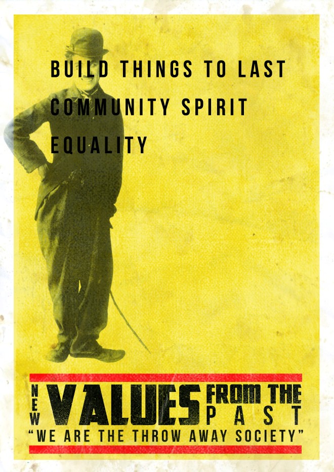
This is my newer version of the field poster and project ‘NEW VALUES FROM THE PAST’. Feedback from my previous design pointed out that the design looked too contemporary and that it portrayed a wrong sort of meaning. So what I have done is make an original poster in the style of the retro screen printed posters that were popular in the 1960’s onward. I have added a modern twist with the typography at the top, using a modern font in Bebas Neue and modern layout to suggest that these are the values we wish to bring forward to the modern day.
By using filters and original screen printed ink I was able to create an authentic background for the whole design, coupled with the title at the bottom I feel makes this poster look as if it has been screen printed in the 1960’s. In addition to this I have used a limited range of colours like they did back in the day when these posters were being first created.
In my previous poster was very busy and now looking back, overcrowded. Now I have sort have taken a minimalist approach with the use of negative space on the right had side.
The figure head for our campaign was famous actor Charlie Chaplin and decided we would like to bring him back from the past because of his inspirational scenes in acting and on the big screen, hence the reasoning why he is on the poster.
Essentially with this design I has modern elements included but in the style of an old fashion screen printed style, which I am very happy with, especially comparing it to my previous design.


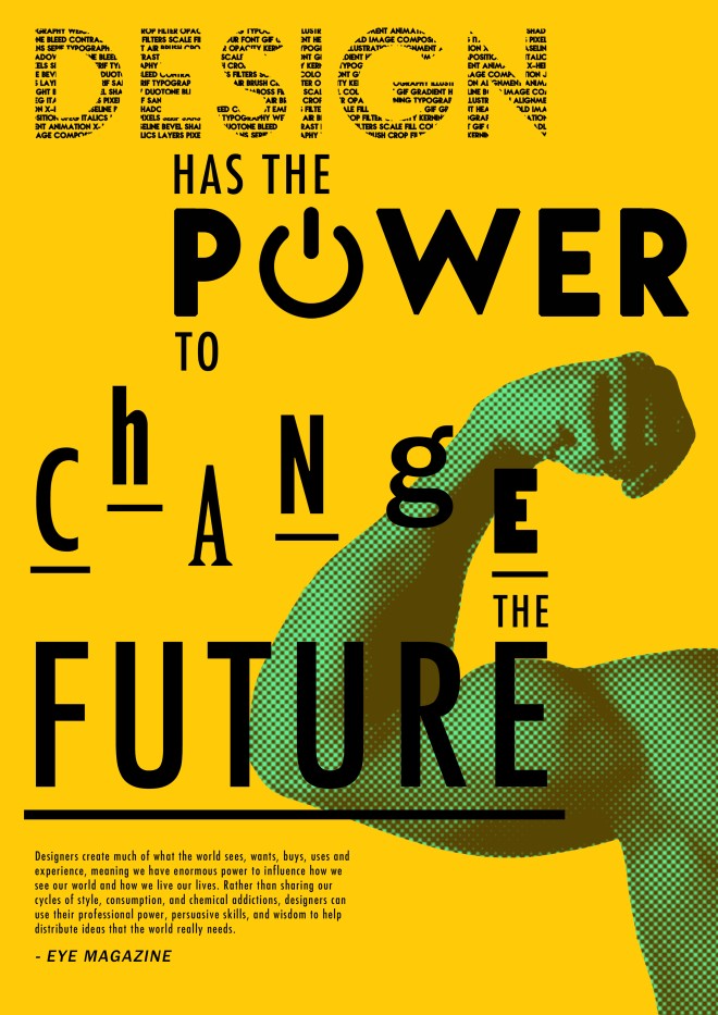


 This design is just an experimentation with filters and typographic forms. My favourite element of this design is the expressive type, CHANGING and SHAPING. They both express the word very well, giving the audience a good perspective of the words. For the word changing, by choosing different fonts and having each letter sit on a different baseline, helps give a true meaning of the word. In addition to this, the collage of images gives the whole piece additional meaning by showing how fashion has changed over the past few decades.


